
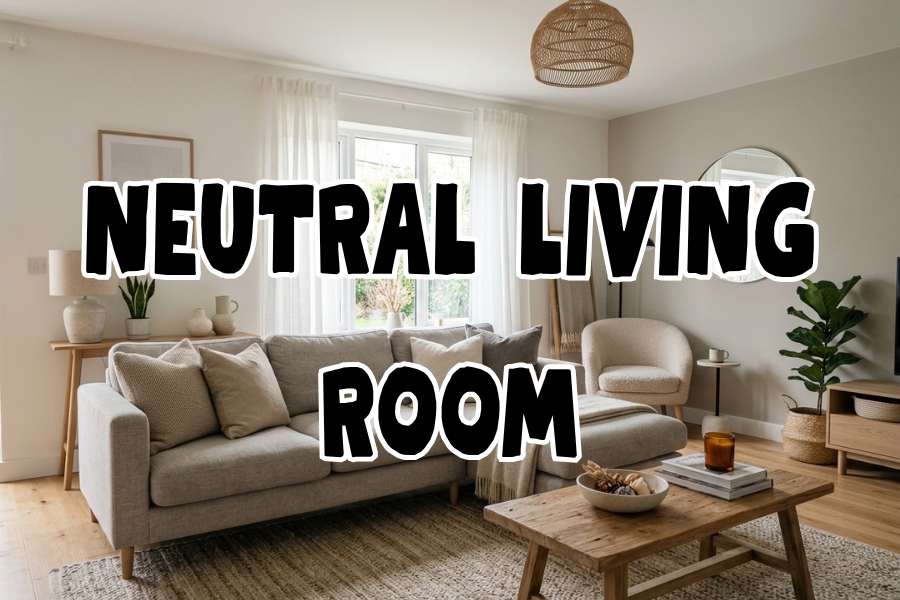
I repainted my living room four times in three years before I figured out what “neutral” actually means. I thought it meant safe — beige walls, beige couch, call it a day.
What it actually means, once you get it right, is a room that looks expensive without being loud, and that you don’t get sick of by year two.
That’s the whole appeal of a neutral living room, and it’s also why it’s such a deceptively hard look to nail. Too flat and it reads like a rental unit. Too matchy and it reads like a showroom nobody actually lives in.
My own living room is 14×16 feet, north-facing, with almost no direct sun — which matters a lot for neutral palettes, more than most posts tell you.
A warm greige that looked gorgeous in my friend’s south-facing apartment looked flat-out gray and depressing in mine. I had to relearn the whole color logic for my own light.
This isn’t a moodboard of “inspo.” These are 26 specific, workable ideas — some cheap, some a real investment — pulled from stuff I’ve done, stuff readers have told me about in comments, and a few things I’ve watched friends get right (and wrong) in their own places.
I’m organizing them roughly by category: color and walls, furniture and layout, texture and layering, lighting, and the small finishing details that actually make a neutral room look intentional instead of just empty.
Color & Walls
1. Test your neutral paint in your actual room, not on the swatch card

This is the one everyone skips and it’s the one that ruins the most rooms. Neutral paint colors shift dramatically depending on your light direction, your flooring, and even your furniture’s undertones. A friend of mine painted her entryway closet doors twice chasing the “right” white — turns out white has something like 40 different undertones, and hers kept reading yellow next to her cool-toned oak floors.
Buy the $6-8 sample pots, not the peel-and-stick swatches, and paint a 2×2 foot square directly on your wall. Look at it in the morning, at midday, and at night with your lamps on. Neutral paint is the one category where the sample size genuinely matters more than the color name.
Pro tip: If your room doesn’t get much direct light, skip anything labeled “greige” with a strong gray base — it’ll read flat and cold. Look for warmer neutrals with a hint of yellow or pink undertone instead; they hold their warmth even in low light.
2. Try warm white instead of true white for trim

True white trim against a neutral wall can look almost clinical, especially in older homes with warm-toned wood floors. Warm whites (anything with a touch of cream or ivory in it) blend instead of contrast, which keeps the whole room feeling cohesive rather than segmented into “wall zone” and “trim zone.”
The trade-off: warm white trim shows dust and scuffs a little less than true white, but it also won’t give you that crisp, gallery-wall contrast some people want. If you’ve got statement art you want to pop, true white trim still wins.
3. Use a tonal accent wall instead of a color accent wall

Accent walls don’t have to mean a bold color. A tonal accent wall — one shade darker or lighter than your main wall color, same color family — adds depth and defines a zone (like behind a sofa or TV) without breaking the neutral palette. It’s the difference between “this room has depth” and “this room has a decision I might regret.”
This works especially well in open-concept spaces where you want to visually separate the living area from a dining or kitchen zone without adding a wall.
4. Consider limewash or plaster-effect paint for texture without color

This one’s had a real moment — I’ve seen it pop up across enough home renovation accounts that it’s clearly not a passing trend, and it solves a genuine problem: flat neutral walls can look a little lifeless in photos and in person. Limewash paint (or a limewash-effect product, since true limewash is trickier to apply) gives you subtle cloudy variation in the same color, so the wall has movement without adding pattern or color.
It’s more expensive than standard paint — expect to pay noticeably more per gallon — and it’s less forgiving to apply evenly, so if you’re not confident with a brush, this might be the one splurge where hiring it out is worth the cost.
Furniture & Layout
5. Anchor the room with one substantial neutral sofa

The biggest neutral-room mistake I see is people buying a small, cheap sofa because they’re scared of committing to a big piece in a light color. But a too-small sofa in a neutral room actually reads cheaper, not safer, because there’s no color to distract from the proportions. Go slightly bigger than feels comfortable, in a slightly nubby or textured fabric (not flat cotton) so it doesn’t look like a slab.
Bouclé and performance chenille are the two fabrics I’d actually recommend if you have kids, pets, or you just eat on the couch like a normal person. Flat linen looks gorgeous on day one and shows every water ring by week three.
6. Mix warm and cool neutrals deliberately, not accidentally

A common misconception is that “neutral” means everything has to match exactly. It doesn’t — and a room where every single piece is the exact same beige actually looks flatter and cheaper than one that mixes warm taupe with cool greige with a bit of true white. The contrast between undertones is what gives a neutral room dimension.
Pro tip: Pick one dominant undertone (warm or cool) for your biggest pieces — sofa and rug — and let smaller pieces like pillows and throws play in the other family. That’s the trick that keeps “mixed neutrals” from turning into “mismatched neutrals.”
7. Use a slightly darker rug than you think you need

Light rugs in a light room disappear, and once the rug disappears, the whole floor plan loses definition — especially in open layouts. A rug two or three shades darker than your walls (still within the neutral family — think a warm taupe or soft charcoal, not black) grounds the seating area and actually makes the lighter furniture around it look more intentional.
This is also just the practical choice. A too-light rug in a high-traffic living room shows every spill and shoe mark, and neutral doesn’t mean you have to live in fear of your own carpet.
8. Float furniture away from the walls

In a neutral room, furniture placement is doing more visual work than color, so layout mistakes show up more obviously than they would in a bolder space. Pushing every piece flush to the wall is the classic starter-apartment habit, and it tends to make rooms feel like waiting rooms. Pulling your sofa even 8-10 inches off the wall, and angling a chair slightly instead of squaring it off, makes the whole room feel considered instead of just furnished.
9. Add one piece in a natural wood tone as a break from the palette

An all-fabric, all-painted neutral room can start to feel a little soft and shapeless. One piece in a warm, visible wood grain — a coffee table, a media console, even just a side table — gives the eye a hard edge and a different material to land on. It doesn’t break the neutral scheme; wood tones read as neutral too, and they add the texture variety that keeps the room from feeling one-note.
Texture & Layering
10. Layer at least three different textures in every seating area

This is the actual secret to a neutral room that doesn’t feel boring, and it’s the thing that separates a considered space from a beige box. Smooth (a leather ottoman), nubby (a bouclé throw pillow), and woven (a jute or rattan basket) in the same color family reads as styled. All-smooth or all-flat reads as unfinished, no matter how well the colors coordinate.
11. Use a chunky knit or waffle-weave throw, not a thin one

A reader left a comment a while back that stuck with me: she’d bought three different “cozy” throws that all photographed fine and felt like nothing in person — thin, synthetic, no drape. The ones that actually make a neutral couch look intentional have visible texture and weight to them. If you can’t feel the weave through the packaging photo, skip it.
12. Bring in raw materials — linen, jute, rattan, unfinished wood

Raw, slightly imperfect materials do a lot of heavy lifting in a neutral room because they add visual texture without adding color. A jute rug under a coffee table, a rattan pendant light, linen curtains left slightly wrinkled rather than pressed stiff — these all read as “collected over time” rather than “bought as a matching set last Tuesday,” which is exactly the vibe most neutral rooms are actually going for.
Pro tip: Iron your linen curtains once, right after hanging, then never again. Slightly relaxed linen looks expensive; bone-dry-and-stiff linen looks like a hospital curtain.
13. Add a boucle or shearling accent chair

If your sofa is a flatter fabric, one heavily textured accent chair does a lot to break up the monotony. It doesn’t have to be a big investment — a lot of the mid-range furniture brands do a solid bouclé swivel chair now, and it reads far more expensive than its price tag once it’s styled with the rest of a textured room.
14. Mix matte and shine finishes on hardware and fixtures

Matte black, brushed brass, or aged bronze hardware against neutral walls and furniture gives you contrast points without introducing new colors. Just don’t mix more than two metal finishes in one room — I made that mistake early on, matte black switch plates plus brushed brass lamps plus a chrome floor lamp, and it read as indecisive rather than eclectic.
Lighting
15. Get your bulb temperature right before you touch anything else

This is the single highest-impact, lowest-cost fix on this entire list, and almost nobody talks about it. Cool white bulbs (4000K+) make neutral walls look sterile and slightly blue at night. Soft white or warm white bulbs (2700-3000K) make the exact same paint color look warm and inviting after dark. I swapped every bulb in my living room for warm white ones and it changed the whole feel of the room for about $20.
16. Layer three light sources at three different heights

A single overhead light is the fastest way to make a neutral room feel flat and under-decorated, because it removes all the shadow and depth that texture is supposed to create. Aim for a floor lamp, a table lamp, and either a ceiling fixture or wall sconces — three different heights of light so the room has visual layers even after dark.
17. Use a statement lamp base as your one “loud” piece

Neutral doesn’t mean boring, and every neutral room needs one piece that’s allowed to have a little personality — a sculptural lamp base, an interesting silhouette, something with a curve or an odd proportion. Because everything around it is calm, this one piece gets to actually stand out instead of competing with a busy room.
Finishing Details
18. Hang art that isn’t neutral

This trips a lot of people up — they build a fully neutral room and then hang neutral art on top of it, and the whole wall disappears. One piece of art with actual color or high contrast (even just black and white with strong contrast, not soft gray-on-gray) gives the eye something to focus on and keeps the room from reading as one flat wash of beige.
19. Bring in real plants, not just neutral-toned faux ones

Green is technically the one color that always works in a neutral room, because it reads as natural rather than “decor color.” A large fiddle leaf fig or snake plant in the corner does more to make a neutral room feel alive than another cream throw pillow ever will. If you genuinely can’t keep plants alive (no judgment, I killed three pothos before giving up and switching to snake plants specifically because they’re nearly impossible to kill), a well-made faux olive tree is a fine substitute — just skip the ones with obviously plastic-looking leaves.
20. Style your coffee table in odd numbers, varied heights

A tray, a stack of books, and one taller object (a small vase or sculpture) reads as styled. Four evenly-spaced identical candles reads as a hotel lobby. Odd numbers and varied height are basic styling rules for a reason — they mimic how things actually look when they accumulate naturally instead of being placed all at once.
21. Use textured ceramics instead of smooth, glossy ones

Matte, textured, slightly irregular ceramic vases and bowls fit the “collected, not matched” feel that makes neutral rooms work. Glossy, perfectly uniform ceramics can look a little sterile against soft fabrics and natural materials — save the glossy finishes for a single statement piece if you want one, rather than using them throughout.
22. Add a woven or wood-framed mirror

Mirrors bounce light around a room, which matters even more in neutral spaces where you’re relying on light and shadow (rather than color) to create visual interest. A woven rattan or natural wood frame keeps it in the neutral material family instead of adding another metal finish to juggle.
23. Don’t skip window treatments — they’re doing more work than you think

Bare windows in a neutral room can make the whole space feel unfinished, almost like the room is mid-move. Simple linen curtains, even inexpensive ones, soften the hard lines of a window frame and add another layer of that natural texture the whole scheme depends on.
Small-Space & Budget Considerations
24. In small living rooms, keep walls and large furniture the same tone

If you’re working with a smaller space — my own first apartment living room was 11×9 feet — keeping your walls and your largest furniture piece in the same neutral tone removes visual “stopping points” and makes the room read as bigger than it is. Save contrast for smaller accent pieces instead of your sofa.
25. Know which of these to splurge on and which to buy cheap

Not every neutral-room element needs the same budget, and figuring this out is what actually keeps the total cost manageable. Here’s roughly how I’d allocate a budget if I were starting from scratch:
| Item | Splurge or save? | Why |
|---|---|---|
| Sofa | Splurge | You touch it daily; cheap fabric pills and sags within a year |
| Rug | Splurge if budget allows | Anchors the whole room; cheap rugs shed and flatten fast |
| Throw pillows | Save | Easy and cheap to swap seasonally; no need to overspend |
| Lamps | Mixed | Splurge on one statement lamp, save on the rest |
| Coffee table | Save | Lots of solid mid-range options; not worth premium pricing |
| Curtains | Save | Budget linen-look panels look nearly identical to pricier ones once hung |
| Paint | Save on paint, splurge on samples | Mid-range paint performs fine; getting the color right matters more than the brand |
26. Choose your neutral base by undertone family, not by name

Paint and fabric names are marketing, not information — two different “greige” fabrics can have completely different undertones. It’s more useful to think in terms of warm (yellow/pink base), cool (gray/blue base), or true neutral (very little undertone either way), and pick one family to dominate your big pieces.
| Undertone family | Best for | Watch out for |
|---|---|---|
| Warm (cream, taupe, warm greige) | Rooms with low or north-facing light | Can read yellow-ish under cool LED bulbs |
| Cool (true gray, cool greige) | Bright, south-facing rooms with lots of natural light | Can look flat or cold in low-light rooms |
| True neutral (bone, oatmeal, natural linen) | Rooms that get mixed light throughout the day | Hardest to shop for since paired items often skew slightly warm or cool |
Where I’d Start If I Were Redoing My Room Today
If I were starting from zero again, I wouldn’t buy a single piece of furniture first. I’d get the paint sample squares up on the wall, live with them for a week, and get the bulb temperature sorted — because I’ve now watched that $20 fix change a room more than a $1,200 sofa did, and I wish someone had told me that three apartments ago. Everything else — the textures, the layering, the one loud lamp — is easier to get right once the base of the room is actually working for your light and your space, instead of fighting it.
A neutral living room isn’t about removing color. It’s about being deliberate with everything else — texture, tone, light, material — since you don’t have color doing the visual work for you. That’s also exactly why it holds up over time. You’re not going to get sick of taupe the way you’d get sick of a trendy paint color, but you will notice, fast, if the texture and lighting aren’t carrying their weight.


Leave a Reply