
I laid out my first gallery wall entirely on the actual wall, hammering in nails one at a time and adjusting as I went, and ended up with eleven extra nail holes and a layout that was noticeably crooked by the time I stepped back far enough to see the whole thing.
It took me repainting that section of wall twice before I figured out the one step that actually matters: you plan a gallery wall on the floor first, not on the wall, and almost every mistake people make comes from skipping that.
If you’re trying to figure out how to create a gallery wall in your living room, you’ve probably already scrolled through a hundred inspiration photos and felt like the gap between “that looks amazing” and “I have no idea how they actually did that” is bigger than it should be.
It’s honestly not that complicated once you know the sequence — but the sequence matters a lot more than people expect, and skipping steps is exactly how you end up with a wall that feels cluttered instead of curated.
This is the actual process I use now, plus the mistakes I made getting there, so you can skip most of the trial and error.
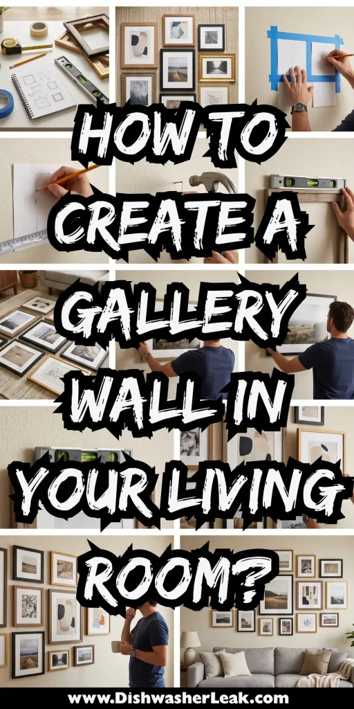
Step 1: Pick Your Wall and Measure It Properly
Before you buy a single frame, measure the actual wall space you’re working with — width and height, plus note any outlets, light switches, or furniture edges (like the top of a couch or console table) that the gallery wall needs to sit above or around. A living room gallery wall typically looks best starting about 6–8 inches above the furniture below it, and the whole arrangement usually reads best when it takes up roughly two-thirds of the available wall width, not the full span edge to edge.
Pro tip: if your gallery wall is going above a couch, measure from the top of the couch back cushions, not the floor — a wall arrangement that’s centered based on floor-to-ceiling math often ends up looking too high once actual furniture is in the room.
Step 2: Choose a Layout Style Before You Choose Any Frames
This is the step most people skip, and it’s the reason a lot of gallery walls end up feeling random instead of intentional. There are a few genuinely different layout approaches, and picking one first will tell you what size and shape frames you actually need to buy, instead of buying frames you like and hoping they fit together.
| Layout Style | Best For | Trade-off |
|---|---|---|
| Grid layout (even rows/columns, matching frame sizes) | Modern or minimalist living rooms | Least forgiving — spacing has to be precise |
| Salon-style (mixed sizes, organic arrangement) | Eclectic or maximalist spaces | Most flexible, but easy to overcrowd if you’re not careful |
| Symmetrical cluster (mirrored around a center point) | Traditional or formal living rooms | Requires an even number of pieces or a strong center anchor |
| Linear row (single horizontal line of frames) | Narrow walls, hallways, above a console | Simple to execute, less visually dynamic |
I switched from planning a salon-style wall to a symmetrical cluster halfway through my own living room project, mostly because I kept adding “just one more piece” and it started looking cluttered rather than curated — a symmetrical layout forced me to actually edit down to what mattered instead of accumulating frames.
Step 3: Lay the Whole Thing Out on the Floor First
Once you know your layout style and have your frames (even if some are still empty), lay the entire arrangement out on the floor exactly as it’ll go on the wall. This is the step that saves you the most time and the most nail holes — you can move things around freely, step back, take a photo from a distance, and actually see problems before they’re permanent.
Take a photo of the floor layout from directly above if you can (standing on a chair works fine), since a straight-on photo shows spacing issues that are harder to judge just looking down at an angle. Leave the layout on the floor for a day if you can — walking past it a few times tends to surface spacing issues you didn’t notice on the first look.
Pro tip: use painter’s tape to trace the outer boundary of your layout on the floor before you start moving pieces around. It gives you a fixed reference point so the whole arrangement doesn’t slowly drift wider or taller as you adjust individual pieces.
Step 4: Make a Paper Template Before You Touch the Wall
Trace each frame onto craft paper (or use the paper the frames came packaged in), cut out the shapes, and tape the paper templates directly to the wall in your planned arrangement. This lets you mark exactly where each nail or hook needs to go without a single frame actually touching the wall yet, and it’s infinitely easier to reposition a piece of paper than to patch a nail hole in the wrong spot.
Use a level on each paper template before marking your hanging point — even a small tilt on one piece throws off the whole arrangement once everything’s hung, and it’s much easier to catch on paper than after the frame’s already up.
Step 5: Decide Between Nails, Hooks, or Command Strips
What you use to actually hang each piece depends on the wall, the weight of what you’re hanging, and whether you’re renting. Standard picture-hanging nails work well for permanent walls and heavier framed pieces, hollow-wall anchors are worth it for anything heavier than a couple of pounds, and Command strips or hooks are the better option for rental apartments where wall damage is a deposit issue.
If you’re using Command products, check the weight rating on the actual package rather than assuming — the basic clear strips are usually rated for about a pound, which isn’t enough for most framed pieces with glass. The heavier-duty picture-hanging strips (the interlocking kind) hold significantly more weight and are worth the few extra dollars if you’re not using nails.
Step 6: Hang From the Center Out (Not Left to Right)
Once your paper templates are marked and your hardware is chosen, hang the most central or largest piece first, then work outward in both directions rather than starting from one side and moving across. This keeps the whole arrangement balanced as you go, instead of ending up with the last piece needing to fit into whatever space happens to be left.
Leave roughly 2–3 inches of spacing between frames for a cohesive but not cramped look — anything tighter starts to feel visually busy, and anything wider starts to feel like separate pieces rather than one arrangement.
What a Gallery Wall Actually Costs
Framing is usually the biggest expense in a gallery wall project, more than the art itself. Here’s roughly what to expect depending on how you source it:
- Budget approach ($50–$120 for 8–10 pieces): thrifted or secondhand frames, printed photos or free downloadable art, mismatched-but-coordinated frame colors unified with a coat of spray paint.
- Mid-range approach ($150–$300): a mix of purchased frames in coordinating finishes, a few printed photos, one or two purchased art prints.
- Higher-end approach ($350+): custom framing for a few key pieces, original art or higher-quality prints, matching frame finishes throughout.
A thrifted-frame gallery wall is one of the better secondhand finds out there specifically because mismatched frame styles are easy to unify with a single can of spray paint — I’ve done this myself with frames that were originally gold, black, and unfinished wood, and one afternoon with matte black spray paint made them look like they were bought as a set.
Common Gallery Wall Mistakes to Avoid
- Hanging everything at the exact same height as your eye line. A gallery wall should have some vertical variation, or it reads as one flat strip rather than an intentional arrangement.
- Mixing too many frame colors without a unifying element. Two or three finishes max, unless you’re deliberately going for an eclectic look and have a strong color-palette thread tying the art itself together.
- Skipping the floor layout step to save time. This is the step that actually saves time in the long run — the fifteen extra minutes on the floor prevents an afternoon of patching nail holes.
- Forgetting to account for furniture below. A gallery wall that looks perfectly centered on a blank wall can look off-center once a couch, TV console, or bookshelf is back in place.
Where I’d Start If I Were Doing This Again
If I were starting a living room gallery wall from scratch today, I’d pick my layout style before buying a single frame, and I’d force myself to do the full floor layout even though it always feels like an unnecessary extra step when you’re excited to just get frames on the wall. Every gallery wall mistake I’ve made traced back to skipping that one step in favor of moving faster — and the wall always took longer to fix afterward than the floor layout would have taken to do properly the first time.




Leave a Reply