
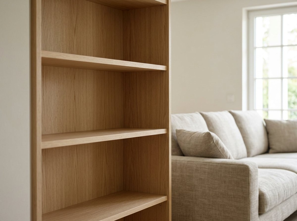
I ripped the doors off a built-in cabinet in my last apartment because I was tired of digging through it, and for about three months afterward it looked worse open than it ever did closed — just a wall of visible clutter I now had to look at every day instead of hiding behind two doors.
It took an embarrassing amount of trial and error, and one blunt comment from a friend (“it looks like you’re mid-move”), before I actually understood what makes open shelving read as styled instead of just exposed.
If you’re staring down a bare set of open shelves in your living room right now, wondering why the Pinterest version looks effortless and yours looks like a garage sale, the answer usually isn’t that you need more stuff or better stuff — it’s that open shelving follows a handful of specific rules that nobody explains clearly.
Styling open shelving well is less about decorating and more about editing, which is a different skill and a genuinely learnable one.
I’m going to walk through this in the order I’d actually approach a shelf myself, starting with the decisions that matter most before you place a single object.
Start by Editing Down, Not Adding More
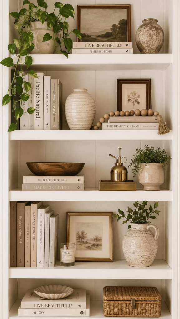
The instinct with a bare shelf is to fill it, but the actual first step is going the opposite direction — pulling everything you’re considering into one pile and cutting it by at least a third before you place anything. Open shelving punishes clutter in a way closed storage doesn’t, because every object on it is visible all the time, not just when you open a door.
Pro tip: If you’re not sure what to cut, remove anything that doesn’t have either a genuine function (books you read, dishes you use) or a specific personal meaning (a piece from a trip, a gift from someone specific) — generic “pretty” objects with no real purpose are almost always the first things to go.
Establish a Loose Color Palette Before You Style Anything
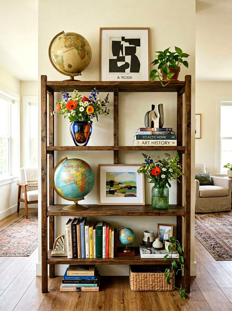
Open shelves read as chaotic fast when every object is a different competing color, so picking a loose palette — two or three main tones plus one accent — before you start placing things prevents the shelf from fighting itself visually. This doesn’t mean everything needs to match exactly; it means the overall effect should feel like a coordinated collection rather than a random assortment.
My friend Naomi redid her living room shelves twice before realizing her issue wasn’t the objects themselves, it was that she owned decor in every color of the rainbow and kept trying to display all of it at once. Once she boxed up anything outside a warm neutral-plus-terracotta palette, the same shelves suddenly looked intentional with barely any new purchases.
Use the Rule of Odd Numbers for Groupings
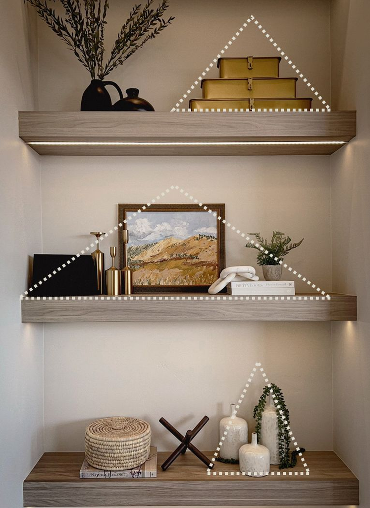
Grouping objects in threes or fives, rather than pairs or fours, genuinely does look more balanced to the eye — this isn’t decorating superstition, it’s a well-documented visual principle that applies to shelf styling specifically well because shelves tend to have a lot of small individual objects that need organizing into digestible clusters.
Pro tip: If you only have two of something (two vases, two frames), add a third unrelated item of a similar height rather than forcing a matching pair — the odd number does more visual work than a perfectly matched set of two.
Vary Height Within Every Cluster
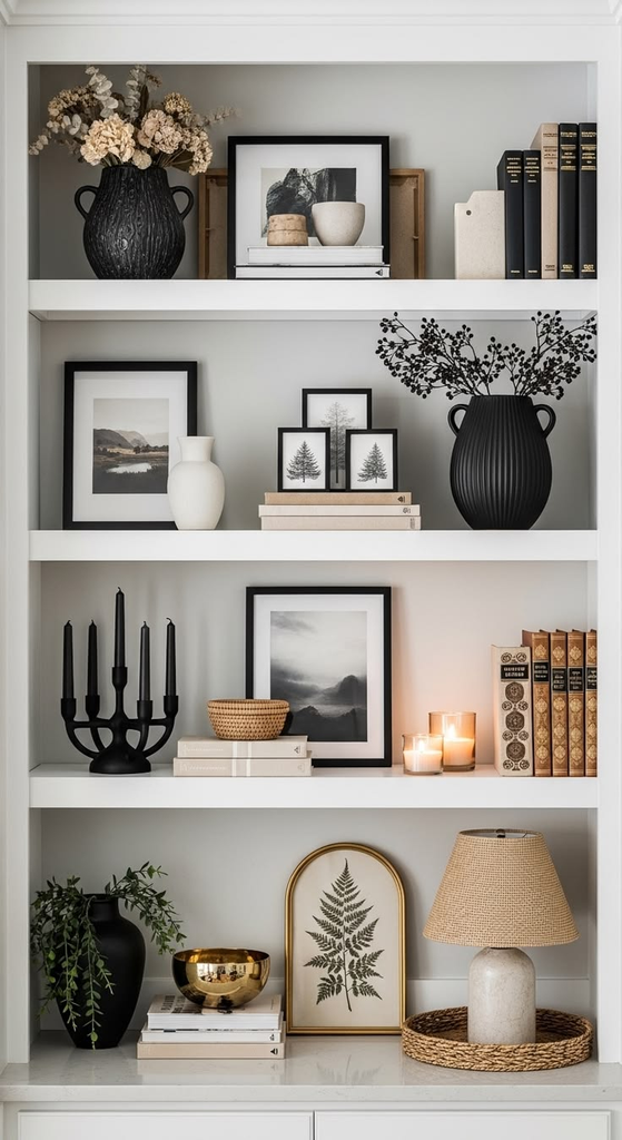
The single most common shelf-styling mistake I see is everything sitting at the same height — a row of books all standing upright, or a line of same-sized objects marching across the shelf. Within each grouping, aim for one tall item, one medium, and one low or wide item, which creates a visual rhythm your eye actually wants to follow rather than a flat line it skims past.
Layer Books Both Vertically and Horizontally
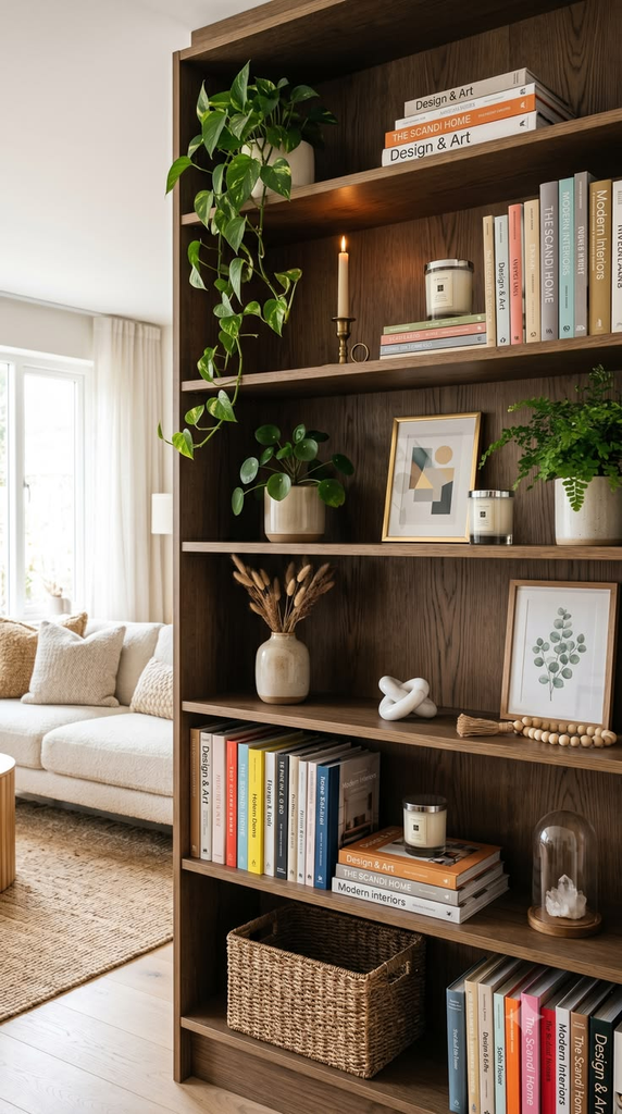
Books are the workhorse of shelf styling because they add both color and height in a way most decor objects can’t, but a full shelf of upright spines reads as a library, not a styled living room. Stack a few horizontally and use the stack itself as a small pedestal for a candle or small object on top — this single technique does more to break up a flat, uniform shelf than almost anything else on this list.
Pro tip: Turn a few book spines inward, showing the page edges instead, if your book collection is a mismatch of loud colors that’s fighting your palette — it’s a quick fix that instantly calms down a busy shelf without buying anything new.
Add at Least One Organic, Textural Element
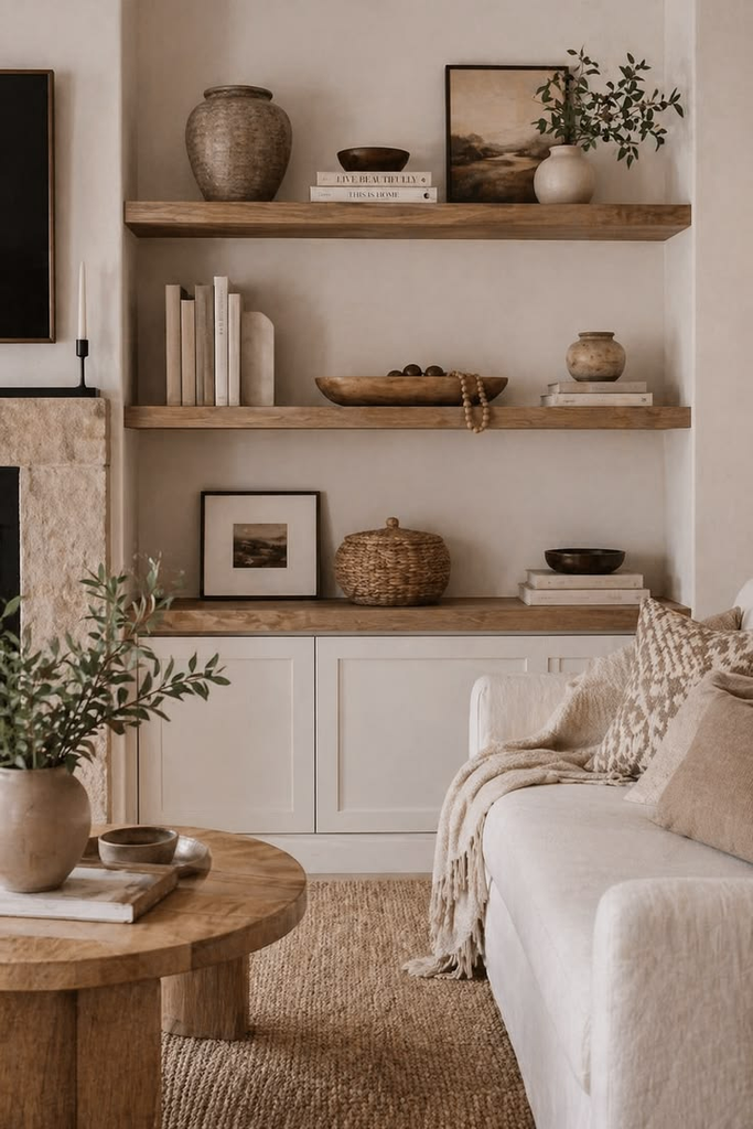
A shelf styled entirely with hard, smooth objects — books, frames, ceramics — tends to feel a little cold and showroom-like. A woven basket, a piece of dried or real greenery, a chunky textured bowl, or a wood object introduces the kind of organic texture that makes a styled shelf feel warm rather than staged.
Leave Genuine Negative Space
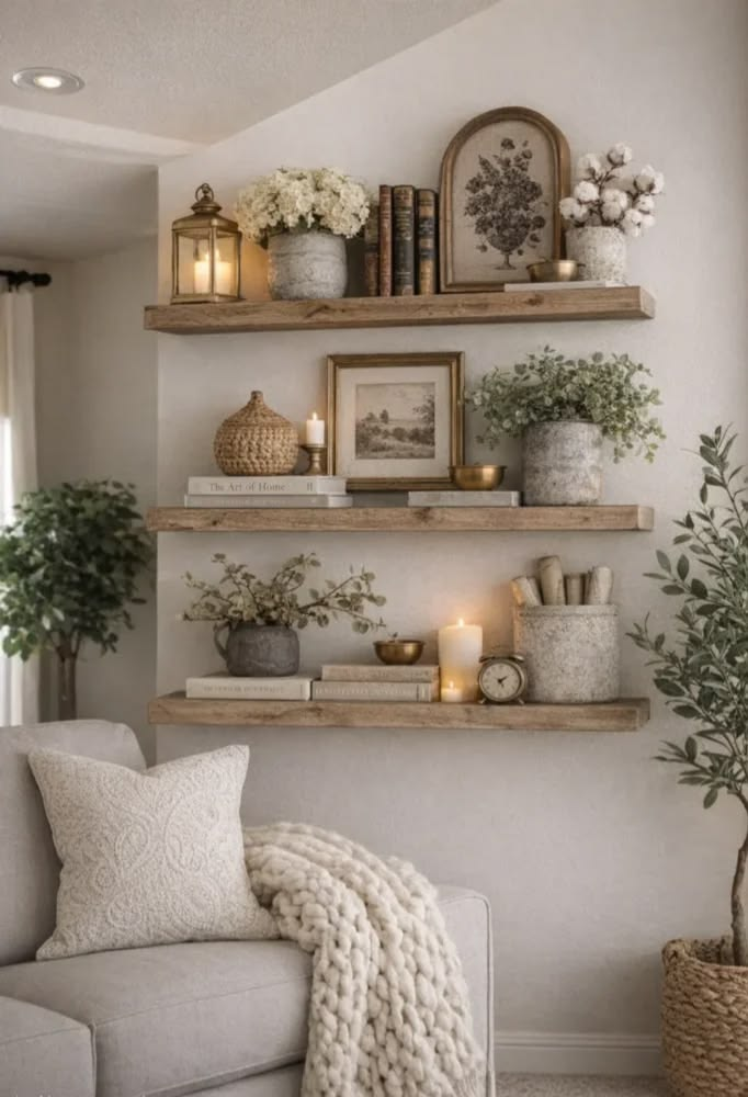
This is the part people find hardest to do on purpose: leaving sections of the shelf visibly empty. Negative space isn’t a placeholder for something you haven’t bought yet — it’s an active design choice that lets your eye rest and keeps the whole wall from feeling like it’s fighting for attention. A good rule of thumb is roughly a third of any given shelf staying visually open at any time.
Use a Consistent Vertical Rhythm Across Multiple Shelves
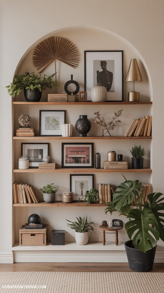
If you have more than one shelf stacked vertically, avoid identical arrangements on each level (same height groupings repeated shelf after shelf) — vary which shelf holds the tallest items and which holds the lowest ones so the whole unit has an overall zigzag rhythm rather than a stack of identical rows.
Rotate Seasonally Instead of Buying New Décor Every Few Months
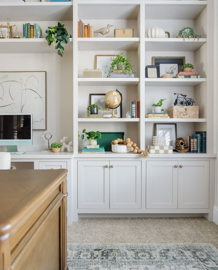
Swapping a handful of accent pieces seasonally — a bowl of pinecones in fall, a vase of fresh greenery in spring — keeps shelves feeling current without buying an entirely new set of decor every few months. Keep your core objects (the books, the frames, the larger vessels) as the permanent backbone, and only rotate the smallest accent pieces.
Pro tip: Store your rotated-out seasonal pieces in a labeled bin, not scattered across other rooms — otherwise you’ll end up rebuying the same category of item every season because you can’t find what you already own.
Account for What’s Actually Behind the Shelf
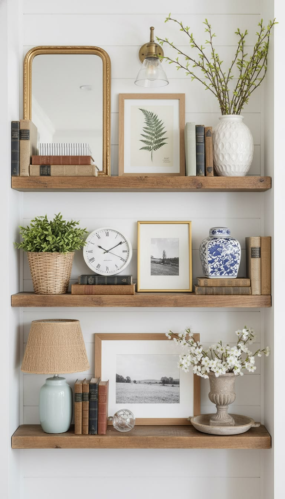
The wall color and material behind open shelving matters more than most styling advice accounts for. A busy, patterned wallpaper behind a heavily styled shelf competes with the objects themselves, while a plain wall lets the styling do the visual work. If your shelves are mounted against a bold wall, simplify what’s on the shelves themselves to compensate.
Mixing Material Types by Shelving Style
Not every open shelf material pairs equally well with every styling approach — a raw wood floating shelf reads differently than black metal industrial shelving, and it’s worth matching your styling density and object materials to what you’re actually working with.
| Shelf Material | Best Styling Approach | Object Materials That Pair Well |
|---|---|---|
| Raw or stained wood | Warm, layered, moderate density | Ceramics, woven baskets, brass |
| Black metal/industrial | Minimal, more negative space | Glass, matte black objects, greenery |
| White painted wood | Flexible — works with most palettes | Almost anything with a cohesive color story |
| Glass shelving | Very minimal, fewer objects | Lightweight items only — heavy pieces look precarious |
| Floating box shelves | Curated single-object display | One or two statement pieces per shelf |
Don’t Ignore Weight Limits When Choosing What Goes Up High
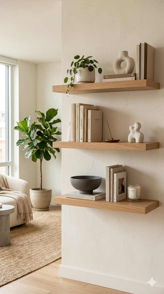
This is the practical safety detail most styling posts skip entirely: floating shelves and many open shelving systems have real weight limits, and heavier decorative objects (ceramics, stacks of books, larger vessels) belong on properly anchored shelves, not decorative floating ones rated for lighter loads. A reader named Wendy mentioned in a comment that a floating shelf pulled straight out of her drywall under the weight of a decorative bowl and a stack of hardcovers — check the actual weight rating before committing your heaviest pieces to the highest shelf.
What to Actually Budget For Restyling a Shelf
You don’t need to buy a full new decor collection to restyle open shelving well — often the bigger cost is time spent editing what you already own, plus a few targeted purchases to fill genuine gaps (a missing textural piece, a couple of frames in a cohesive finish). If you are shopping specifically for shelf styling, expect to spend somewhere between $50 for a handful of small accent pieces and $200+ if you’re adding new lighting, a few ceramic vessels, and framed art across a full shelving unit.
Where I’d Start If I Were Restyling a Shelf From Scratch
If I were starting over on a bare set of open shelves today, I’d pull everything off first, sort it into a keep pile and a store-elsewhere pile, and only then start placing things back — grouping in odd numbers, varying height, and deliberately leaving space I felt tempted to fill. The shelves that actually look effortless are almost never the ones with the most stuff on them; they’re the ones where every object earned its spot, and there’s still room left for your eye to land somewhere quiet.


Leave a Reply