
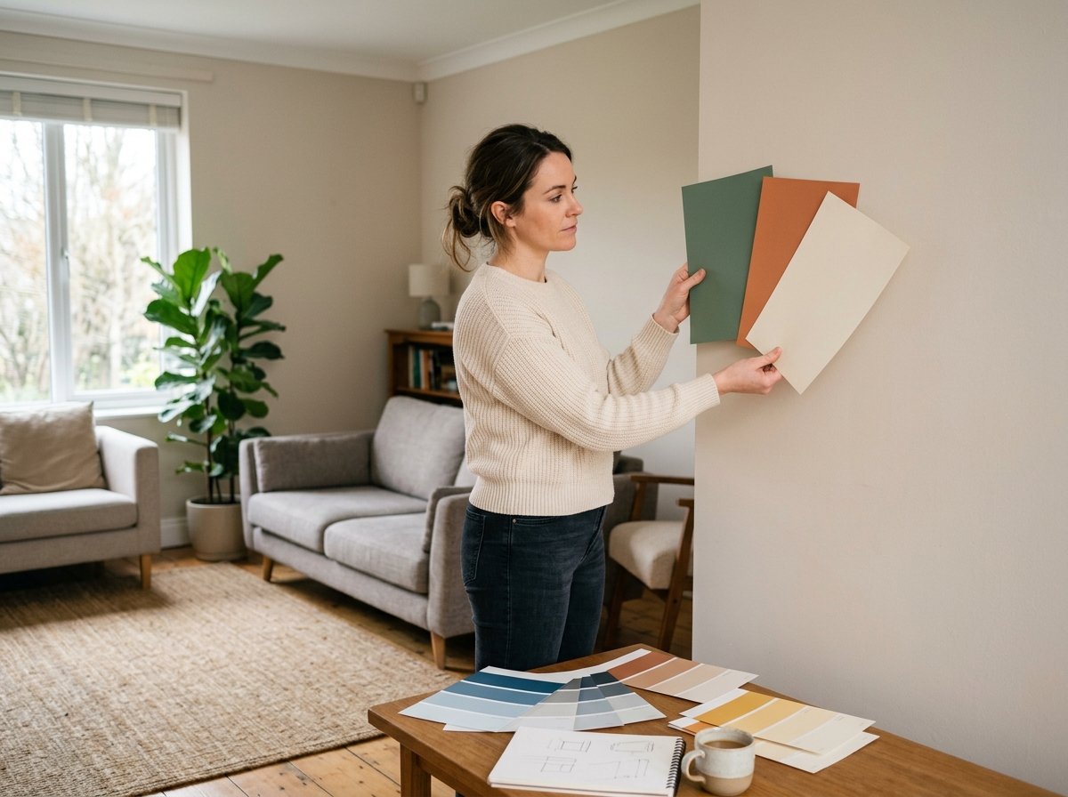
I painted my first living room a color called “Sea Salt” because it looked like the exact calm, breezy blue-gray I wanted in the sample photo online.
It went on the wall a completely different color — more green than blue, and noticeably darker than I expected — and I ended up repainting it twice more before landing on something I actually liked.
Three gallons of paint and two wasted weekends later, I finally understood that choosing a living room color palette isn’t really about picking colors you like; it’s about understanding how color actually behaves in your specific room before you commit to anything.
A living room color palette is one of the more intimidating parts of decorating for beginners because it feels enormously high-stakes — it’s the biggest visual decision in the room, it’s expensive and disruptive to change once it’s done, and there’s a huge range of genuinely conflicting advice out there about how to do it right.
Most guides also skip the actual mechanics of how color palettes work and jump straight to “here are some pretty color combos,” without explaining why those combos work or how to adapt them to your own room’s lighting, furniture, and layout.
This is a full walkthrough of the process, not just a list of pretty palettes to copy — how to figure out your existing constraints before you pick a single color, how undertones and lighting will change what you think you’re choosing, the actual structure that makes a palette feel cohesive instead of random, and how to test everything properly before you commit to a full room.
I’ll flag where it’s worth spending money on samples and testing, and where you can move faster.

Step 1: Audit What You Already Can’t Change
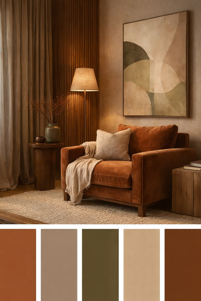
Before you fall in love with any color, take stock of everything in the room that’s expensive or impossible to change right now — your flooring, any built-in cabinetry or trim, a rug or sofa you already own and aren’t replacing. These fixed elements are your actual starting constraints, and building your palette around them saves you from choosing a beautiful color that then clashes with a floor or piece of furniture you weren’t planning on.
If you’re working with warm-toned wood floors, for instance, a cool-toned gray wall color can end up looking muddy or slightly off next to them in a way that’s hard to describe until you see it in person. Take a photo of your existing fixed elements in natural daylight and keep it on your phone as a reference every time you’re comparing paint chips or fabric swatches going forward.
Pro tip: If you’re renting and can’t paint at all, this same process still applies — your walls just become one more fixed element to build the rest of your palette around, using rugs, curtains, and furniture to carry the color story instead of paint.
Step 2: Understand Undertones Before You Pick Anything
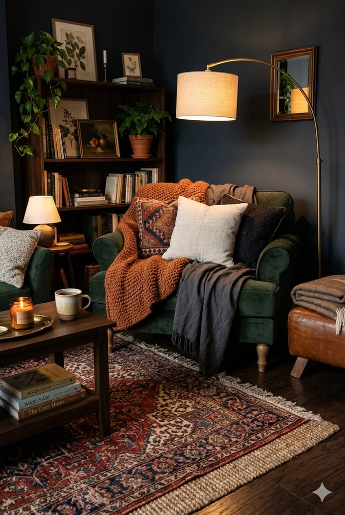
This is the concept that ruined my first paint attempt, and it’s the single biggest reason paint colors look different on the wall than they did in the store or online. Nearly every “neutral” color — white, gray, beige, cream — has a subtle undertone (blue, green, pink, yellow, purple) that becomes much more visible once it’s covering an entire wall rather than a small chip, and that undertone interacts with your room’s lighting in ways a small sample can’t show you.
The fix isn’t to avoid neutrals; it’s to test at a large enough scale to actually see the undertone before committing. Paint a large swatch — at least a two-foot square, not a tiny sample card — directly on your wall in a few different spots around the room, and look at it at different times of day, since undertones can shift dramatically between morning light, midday, and evening lamp light.
| Testing Method | Accuracy | Cost | Time Required |
|---|---|---|---|
| Small paint chip only | Low | Free | Minutes |
| Peel-and-stick large swatch | Moderate-high | Low | Same day |
| Painted 2×2 ft sample on wall | High | Low (one sample pot) | A few days to observe properly |
| Full room repaint, no testing | Unknown until done | High if wrong | Full weekend, plus redo risk |
Step 3: Decide Your Room’s Undertone Temperature First
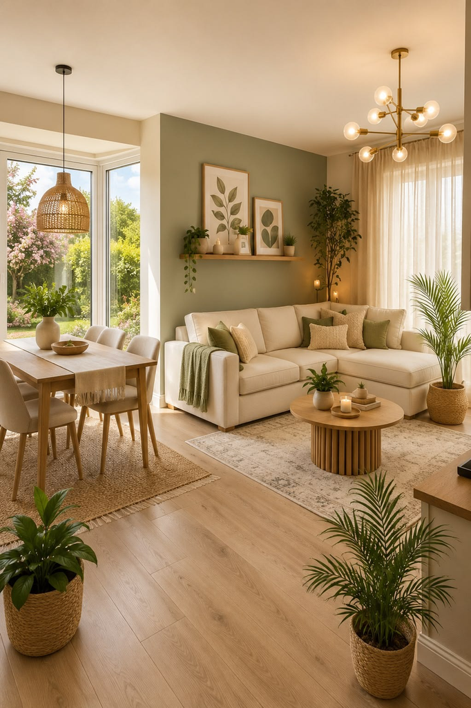
Before picking specific colors, decide whether you want the room to lean warm (yellow, orange, red-based undertones) or cool (blue, green, purple-based undertones) overall, since mixing warm and cool neutrals throughout a room is one of the most common reasons a “neutral” palette ends up feeling slightly off without anyone being able to say exactly why. This single decision filters out a huge percentage of the paint and fabric options you’d otherwise be choosing between.
Your existing fixed elements from Step 1 often make this decision for you — warm wood floors and warm-toned furniture generally want a warm-leaning palette layered on top, while cooler stone, tile, or metal finishes tend to pair better with cooler undertones throughout.
Step 4: Use the 60-30-10 Rule as Your Structure
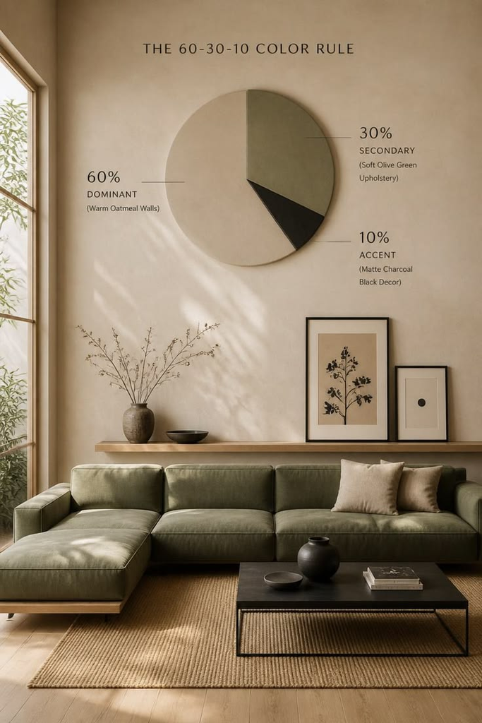
This is the actual mechanic behind palettes that look cohesive instead of random, and it’s worth understanding rather than just copying a pre-made palette without knowing why it works. The idea: 60% of the room is your dominant color (usually walls and largest furniture), 30% is a secondary color (upholstery, curtains, a rug), and 10% is an accent color used sparingly (pillows, art, small decor).
Skipping this structure is how people end up with rooms that feel scattered — introducing a new, unrelated color with every single purchase instead of working within a defined ratio. If you’re stuck deciding where a specific color goes, ask which percentage tier it’s meant to occupy before buying it, and that alone often clarifies whether it actually fits your plan.
Pro tip: If you’re nervous about committing to a bold accent color, remember the 10% tier is the easiest and cheapest to change later — a bold color choice on a couple of throw pillows or a piece of art is a low-risk way to experiment before committing to that same bold color anywhere more permanent.
Step 5: Choose a Dominant Color Based on the Mood You Actually Want
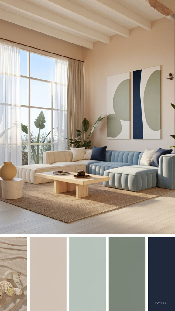
Beyond just picking a color you like, think about the mood each color family tends to create and whether that matches how you actually use the room. Soft blues and greens tend to read as calm and restful, warm neutrals and terracottas feel cozy and grounding, while brighter colors and higher contrast palettes feel more energetic and social — none of these are objectively “better,” but one probably fits your actual living room usage better than the others.
If your living room doubles as a home office or a space where you need to focus, a calmer, lower-contrast dominant color usually serves you better than something highly saturated and stimulating, even if the bolder option looks more exciting in inspiration photos.
Step 6: Pick Your Secondary Color to Create Contrast, Not Just Coordination
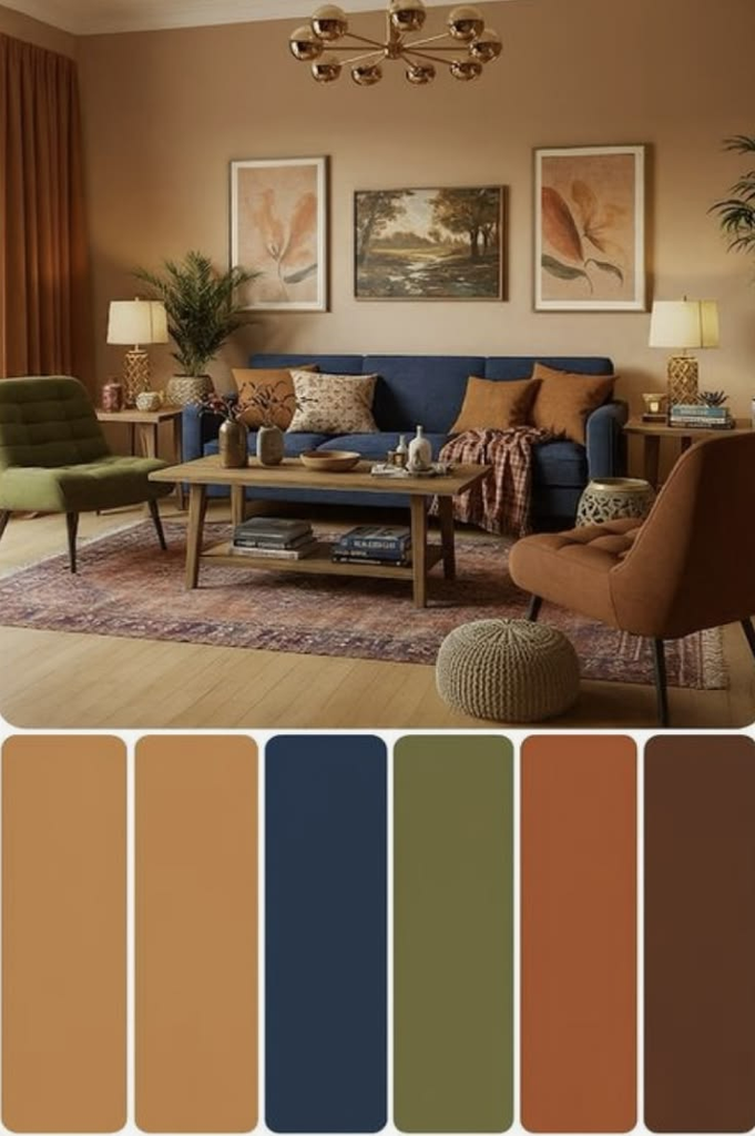
A common beginner mistake is choosing a secondary color that’s simply a slightly different shade of the same color as the dominant one, which can end up looking less intentional than genuine contrast would. A palette with some real contrast — a warm neutral dominant paired with a deeper, more saturated secondary color, for instance — tends to read as more considered than an all-tonal approach, even though tonal palettes can absolutely work when they’re done on purpose rather than by accident.
Fabric and rug swatches are a better place to test your secondary color than paint, since this color usually shows up in larger textile pieces (a sofa, curtains, a rug) rather than the walls themselves.
Step 7: Choose an Accent Color That Actually Gets Used Sparingly
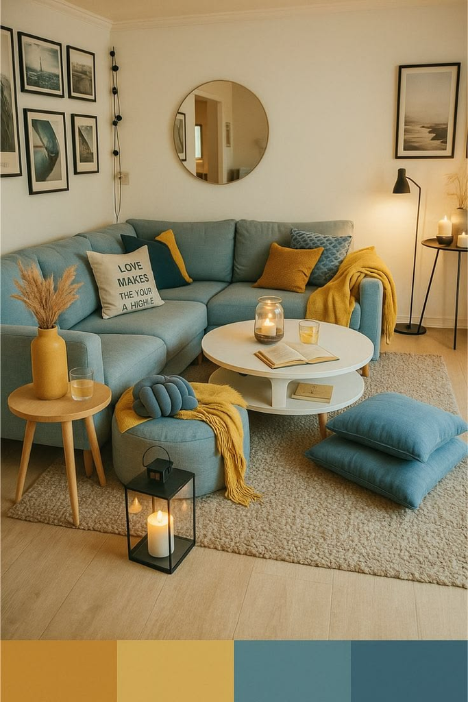
The accent color is where people most often overcorrect after being told to “add a pop of color,” ending up with an accent that appears so frequently throughout the room that it stops reading as an accent at all and starts competing with the dominant and secondary colors instead. True accent usage means the color shows up in maybe three to five smaller spots total across the whole room — a couple of pillows, one piece of art, a vase — not scattered evenly across every surface.
A friend of mine, Jasmine, chose a beautiful deep coral as her accent color and then put it on pillows, a lamp, a vase, a piece of art, and a throw blanket, and the effect ended up reading as a second dominant color rather than a true accent — she ended up removing it from two of those five spots afterward, and the room immediately felt more balanced.
Step 8: Test Your Full Palette Together Before Buying Anything Large
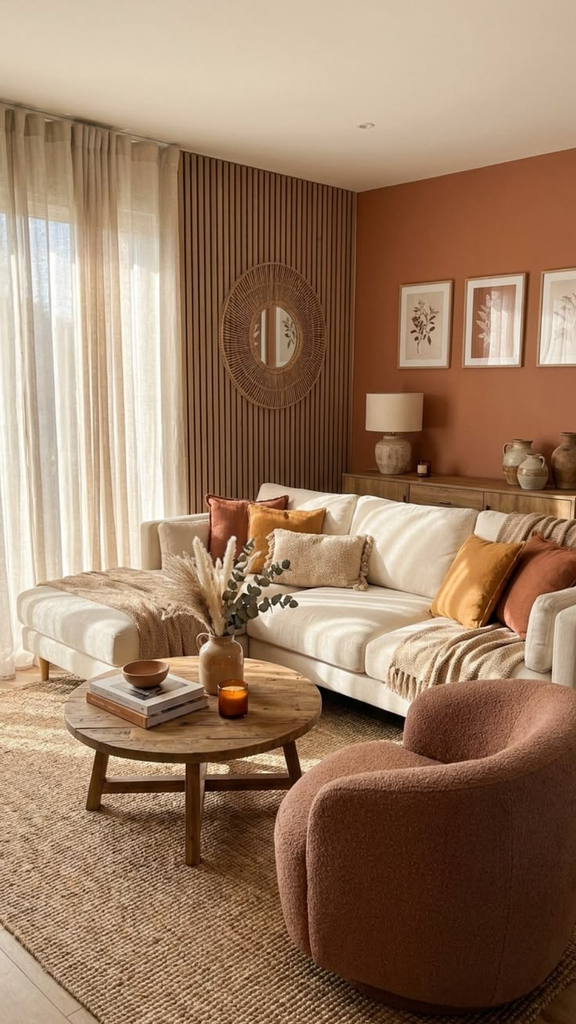
Once you have a dominant, secondary, and accent color selected, gather actual physical samples of all three — a paint swatch, a fabric swatch, and a small accent item or swatch — and look at them together in the actual room, in actual daylight, before committing to any large purchase. Colors that look great independently can clash or fall flat when placed next to each other in person, and this is a much cheaper mistake to catch at the swatch stage than after a sofa has already been delivered.
What it actually costs: A handful of paint sample pots and a few fabric swatches typically run a modest total, which is a genuinely small price to pay compared to the cost of returning or reupholstering a piece of furniture that turned out to clash once it was actually in the room.
Step 9: Account for How Your Specific Lighting Will Change Everything
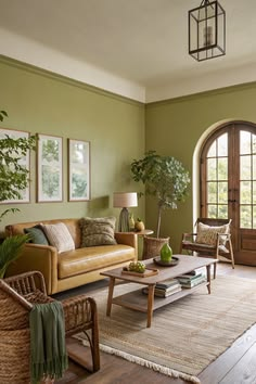
Beyond just natural daylight direction (north-facing rooms tend to get cooler, bluer light; south-facing rooms get warmer light throughout the day), your artificial lighting matters just as much once the sun goes down. A palette that looks perfect under a warm-toned bulb can shift and look slightly different under a cooler, bluer bulb, so it’s worth testing your samples under whatever lighting you actually plan to use in the room, not just in daylight.
If you’re not sure what temperature bulbs you currently have, check the packaging or the base of the bulb itself for the color temperature rating — warmer bulbs generally sit in a lower range on that scale, and cooler bulbs sit higher, and matching that consistently across your fixtures avoids the slightly mismatched feeling of different light temperatures competing in the same room.
Step 10: Give Yourself Permission to Adjust as You Go
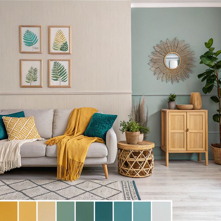
Even with careful testing, it’s common to get most of the way through decorating and realize one element of your palette isn’t quite working the way you expected once everything is actually in the room together — this isn’t a sign you did the process wrong, it’s just a normal part of decorating a space you haven’t lived in yet. The structure from the earlier steps (fixed elements, undertone direction, the 60-30-10 ratio) gives you a framework to adjust within, rather than starting completely over if one piece needs to change.
If I Were Choosing My Palette Again
I’d paint the big test swatches directly on the wall before doing anything else, and I’d genuinely wait a few days and look at them at different times of day before buying a single gallon of real paint. It felt like an unnecessary extra step the first time around, standing in the paint aisle wanting to just pick something and be done with it, but it would have saved me two repaints, a couple of wasted weekends, and the specific frustration of watching “Sea Salt” turn into something I never actually chose.


Leave a Reply